
By Dr. Nick James, Data Scientist, Arowana
This white paper studies trends in the propagation of hydrogen plants and their respective capacity over the past two decades. We introduce a number of mathematical frameworks to reveal new insights into the evolution of hydrogen energy production across a number of geographic regions. We use data from the International Energy Agency.
Hydrogen has great potential as an alternative fuel source and may play a role in the world’s coordinated attempt to reach net-zero emissions during this century. Hydrogen could be used for numerous purposes, including industry, transport, heating and energy production. Indeed by mass, hydrogen contains more than twice the energy potential of natural gas. However, hydrogen in its pure form does not exist naturally on earth. It must be synthesised via a variety of different procedures.
The production of hydrogen is classified by colours according to its mode of preparation. “Green hydrogen’’ refers to production techniques that do not generate any greenhouse gas (GHG) emissions. This is of course the ideal method of production to forward the goal of an alternative energy source that does not contribute further to global warming. Typically, green hydrogen plants use renewable sources of energy (such as solar) to extract hydrogen via the electrolysis of water. This is clearly a desirable process, however, the energy production capacity of green plants has been quite limited. On the other hand, black, brown, and grey hydrogen refers to production techniques that use black coal, brown coal, and natural gas respectively, generating harmful gases including carbon dioxide and monoxide. Blue hydrogen is defined as the generation using natural gas, followed by carbon capture and storage (CSS). This is not a truly zero-emissions process, as not all generated GHGs can be captured.
There is significant variability in a country’s level of sophistication with regards to alternative and clean energy. Many European countries such as Germany have been able to reduce carbon dioxide emissions over the past 50 years, largely driven by their willingness to drive the adoption of new technologies, often with the significant initial cost. Less willing to wear the immediate economic consequences, many developing countries, as well as the United States and Australia, have been more hesitant to commit to green and alternative energy sources. Instead, they continue to utilise energy sources that have already reached economies of scale.
This paper investigates trends in the rollout and prevalence of hydrogen plants by both technology and location. We study the changing propagation and capacity of hydrogen plants over time, with a particular interest in the increasing potential of green hydrogen plants. We also investigate differences in these rollouts on a geographic basis. Our main finding is promising: an exponential increase in the capacity of green plants over time, and a dramatic closing between the capacity of green and non-green plants.
Our data comes from the International Energy Agency, and consists of plants built-in (or projected to be built-in) 2000–2028, a period of T=29 years. Each plant is classified according to one of five underlying technologies: four different types of water electrolysis, which are all green plants, and ``fossil’’, indicating the use of fossil fuels. By aggregating the types of electrolysis, the plants are essentially classified as green or non-green (``fossil’’). For each plant, the location is also recorded, either specified by the country of location or continent. As such, all our analysis proceeds on a continent-by-continent basis, in which we record and analyse only the continent of location. We divide the plants into continental groups as follows: North America, South America, Europe, Oceania, East Asia (China and Japan) and Other Asia (mostly consisting of Indian plants).
In Figure 1, we display all the plants with a known energy capacity in our dataset. Displaying the logarithm of the capacity against the year of construction, we see an approximate linear trend between the log of capacity and the year. This suggests an exponential growth in capacity vs time. Earlier on, we see that fossil (ie non-green) plants are several orders of magnitude greater in capacity than green plants, but this difference reduces dramatically over time. To further explore these findings we implement two linear regressions:
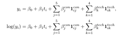
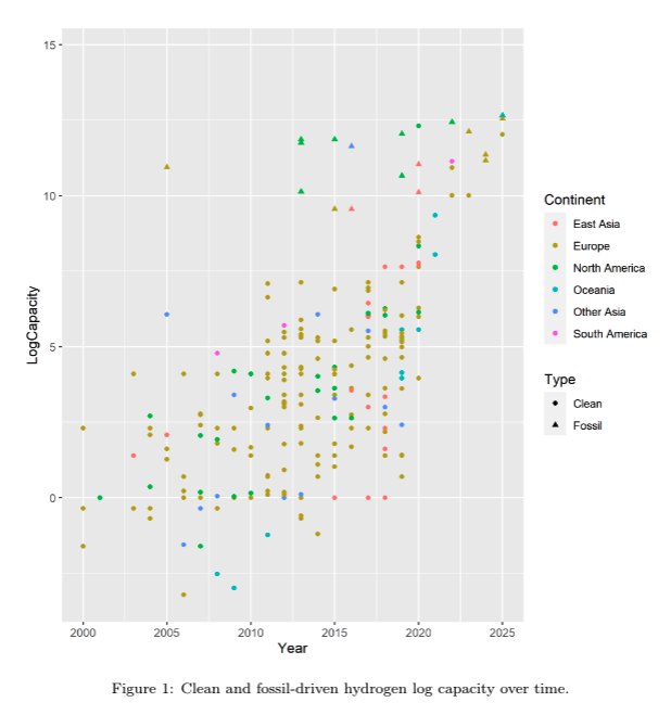
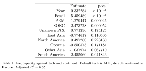
We encode six continents as Europe, North America, South America, East Asia (Japan and China), Other Asia (predominantly India), Oceania, with Europe as the default categorical variable. We also consider five technologies: ALK, PEM, SOEC, Unknown PtX and Fossil, with ALK as our default variable. For model 1, the adjusted R² is 0.17, while for model 2, the adjusted R² is 0.65. This strongly suggests a better fit where capacity is predicted and understood to increase exponentially over time, confirming the qualitative observations in Figure 1.
We include additional details on model 2 in Table 2. Relative to Europe as a baseline, South America has a significantly greater capacity p=0.042, while PEM and SOEC have less capacity than ALK. This could be of potential interest to those interested in owning and operating green hydrogen plants. In particular, one could consider the profitability implications when contrasting the varying costs of electrolysis utilising PEM, SOEC and ALK, and a candidate plant’s respective output.
In this section, we study the geographic propagation of hydrogen plants around the world. We use the same n=6 continent groups as in previous sections. We wish to investigate the changing geographic spread of hydrogen plants and their energy production capacity with time. For that purpose, we convert these time series into rolling distributions.
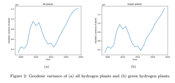
In Figure 2a, we plot the time-varying geographic variance of grouped 5-year distributions. That is, this captures the geographic spread of new plants throughout a rolling 5-year period. As elsewhere in the manuscript, we are consistently interested in the analysis of green vs non-green plants; in this case, due to the comparatively low number of fossil plants, the plot is near identical if we consider all new plants or just all green plants.
Both figures 2a and 2b exhibit the same trajectory between 2004–2024, where geodesic variance increases until 2008, decreases until 2016 and then increases until 2024. Both figures start with an initially low geodesic variance in 2005, which is likely explained by Europe’s dominance in hydrogen plant propagation. During the initial increase, we see several plants appear throughout Asia, which leads to an increase in the variance. Between 2010–2015, the geodesic variance declines, which is likely due to East Asia’s levelling off in hydrogen plant propagation. In 2015–2016, East Asia experiences a significant boost in hydrogen plant commencement. This is largely due to China, whose first plant appears in 2017. Since then, China has accounted for numerous other hydrogen plants. We see a similar pattern for our two collections, all hydrogen plants and green hydrogen plants exclusively. This is predominantly due to the green hydrogen plants accounting for the vast majority of all hydrogen plants. The sharp rise in geodesic variance beyond 2016, may indicate the increased awareness of clean energy and decarbonisation.
To elucidate the changes in plants by continent, we plot the cumulative number of plants and fit linear trends to them in Figure 3. We highlight the results of Europe, North America, East Asia and other Asia in Figures 3a, 3b, 3c and 3d respectively. Europe, North America and Other Asia all display a relatively consistent linear trend throughout the entire period of analysis.
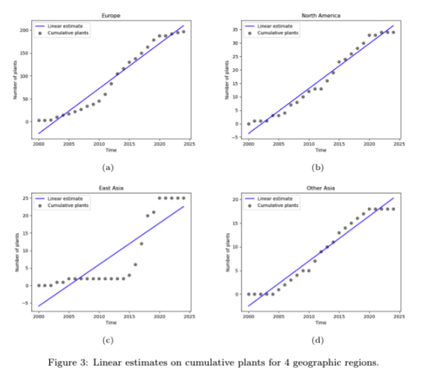
However, East Asia’s cumulative number of plants is not modelled well by a linear fit. The cumulative number of plants is perhaps best modelled by a hyperbolic function, given the relatively constant level between 2000–2015, followed by rapid growth between 2015–2020, and another constant period during the early-mid 2020s. These patterns, which demonstrate the consistency of hydrogen plant propagation over time, may indicate the evolution of each continent’s interest in decarbonisation and hydrogen production
Next, we explore the distance correlation between North America and Europe in Figure 4. Distance correlation is not to be confused with the better known, more widely used Pearson correlation. Distance correlation captures linear and nonlinear associations between two random variables, while Pearson correlation can only detect linear relationships.
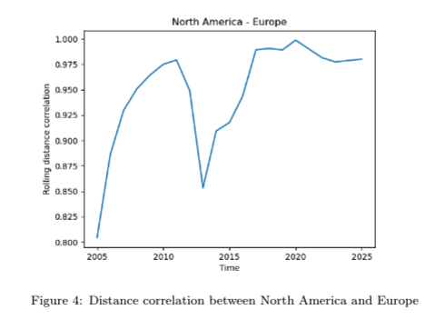
Early on in our analysis window, the distance correlation is low — which is predominantly due to the sparsity of data. Beyond that, our time-varying distance correlation exhibits a local minimum in 2013. During this time, Europe and North America display profound differences in their concavity behaviours in new plants. During this period, Europe’s cumulative plants display a concave up shape, while North American cumulative plants display a concave down shape. Beyond this point, both North America and Europe exhibit relatively consistent linear increases, which is reflected in the high distance correlation between these two regions’ cumulative plants.
In Figures 5a and 5b, we plot the proportion of fossil plants and capacity, respectively, with time. We see that initially, there are no fossil plants, but as soon as the first appears in each continent, it dominates close to 100% of that continent’s hydrogen energy capacity. However, this dips to more reasonable proportions as we approach the end of the period of analysis.
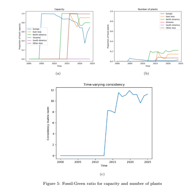
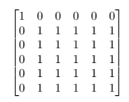
In Figure 5c, we display the time-varying matrix norm over our period. This total inconsistency is zero until 2011 due to either the complete lack of fossil plants (hence no inconsistency between the production vs the number of fossil vs green plants) and then only Europe having fossil plants (so the adjacency matrices have a block diagonal structure):
Then in 2011, we see North America generate a fossil project which takes up 99% capacity as fossil and 20% of plants are fossil. This is the first introduction of inconsistency between the continents in terms of their relationships between their proportions of fossil and green number of plants vs variance. Subsequently, when other continents start to roll out fossil-related projects, they account for most capacity and relatively small # plants, promoting further inconsistency in # fossil projects and their capacity. In 2016, both Other Asia and East Asia establish their first fossil plants.
Please note that these findings are highly dependent on the dataset we have used. Future studies on more up-to-date, and possibly richer datasets, could reveal further insights related to hydrogen plant propagation and their capacity. As always, please feel free to email me at [email protected] if you have any questions related to the white paper.